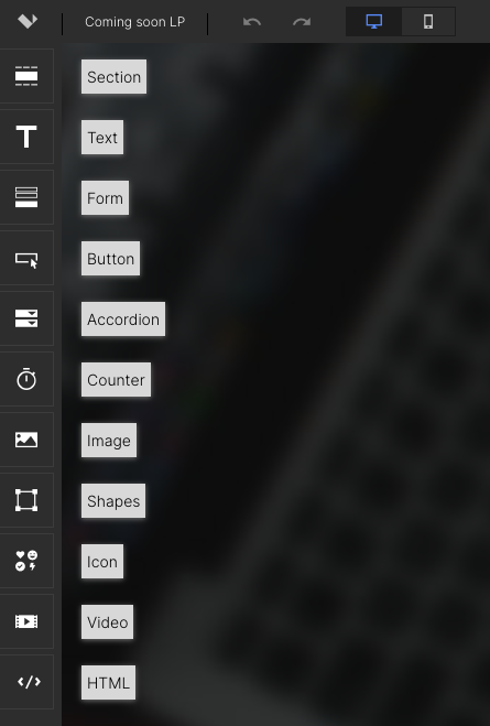
In this article, we’ll look closely at Template Elements in the Landing Page Builder app’s editor.
When you’re editing a template, on the left sidebar, you’ll find a variety of options for drag-and-drop page elements.
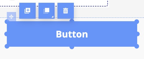
To add any of these elements, simply click on them, drag them onto the screen, and place them where you want them. After adding, you may edit at any time by clicking on it.
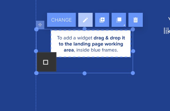
Several options will appear, including:
- Change: If it’s an image element, this option enables you to choose a new image to replace it
- Duplicate: Make a copy of that element to place somewhere else on the page
- Change layer: Moves the element forward or backward in view (for example, if you have a text box placed over an image, changing the layer of the text box would place the image on top of the text, covering it)
- Remove: Deletes the element from the page
Additional editing options are available in the menu on the right. These options will vary depending on the type of element you are editing and will be described below.
See all of the Template Elements currently available below:
When you add a section to your landing page, this window will appear:
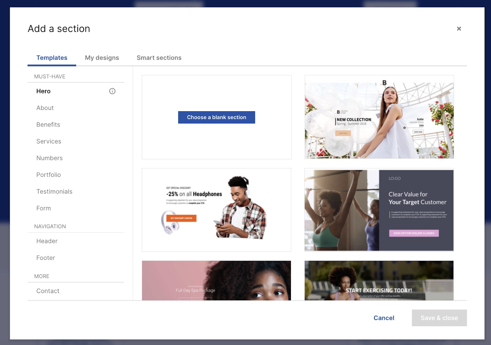
Here, you can choose a section template, choose one of your own designs, or add a “Smart section.”
Template options are organized by function, and include:
- Hero (e.g., a hero image and introductory text)
- About
- Benefits
- Services
- Numbers (e.g., statistics)
- Portfolio
- Testimonials
- Form
- Header
- Footer
- Contact
The “My Designs” tab contains any editable section designs you have previously saved.
Smart sections are custom, un-editable sections. Use these for content that needs to be uniform wherever it appears.
This option enables you to drag and drop a text box onto your landing page:
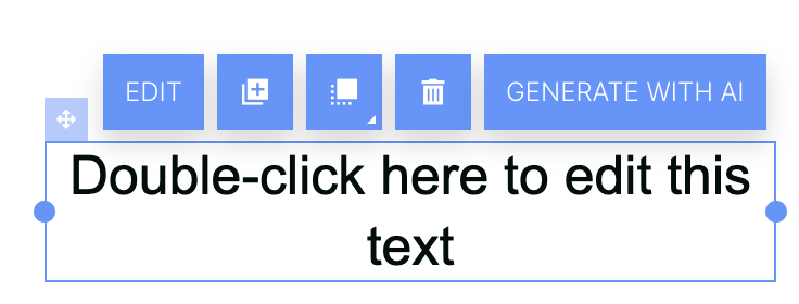
Double-click on the text to change it according to your preferences. You can also edit its appearance using the text editor on the right, as described above.
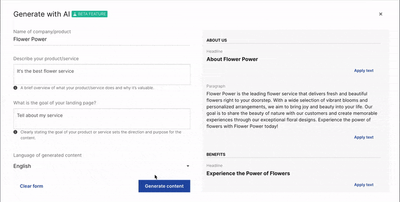
Additionally, you can create AI-generated texts for the landing page based on your product/company name, its description, and the goal of the landing page. Just click the Generate with AI button and add the details in the pop-up window:
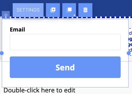
By default, if you drag and drop a form onto your landing page, it will contain an email field and a “send” button.
To build your form, click the settings button at the top of the widget. Then, the “Form settings” window will appear. If you need to access this screen later, you may do so via the “Form settings” button in the right menu.
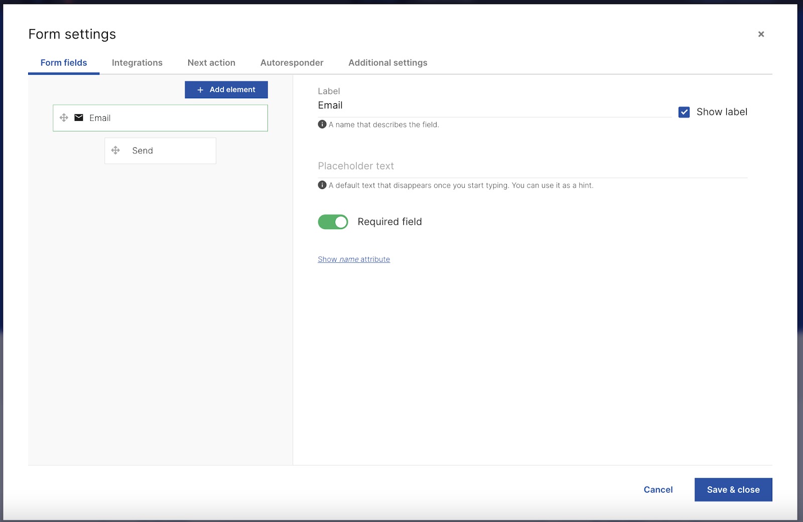
The first tab, “Form fields,” allows you to add and modify fields to your form. To add a new field, click “Add element.” A drop-down menu will appear, containing all of the field types you could add to the form.
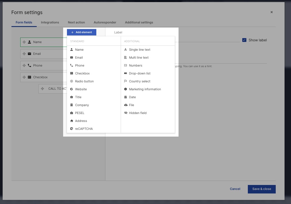
These include:
- Name
- Phone
- Checkbox
- Radio button
- Website
- Title
- Company
- PESEL
- Address
- reCAPTCHA
- Single line text
- Multi line text
- Numbers
- Drop-down list
- Country select
- Marketing information
- Date
- File
- Hidden field
Once you add a field, on the right, you can set a label, placeholder text, and denote whether that field is required.
To remove a field, click the trash icon.
Next, the Integrations tab allows you to send form submission data to another platform, such as a marketing platform, CRM, or task manager.
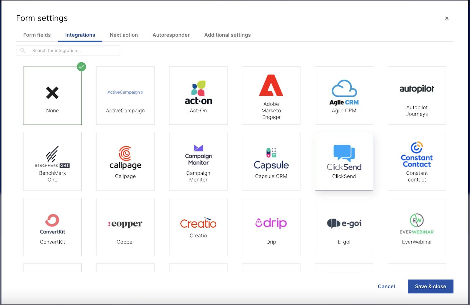
Many different integrations are available for tools such as Salesforce, Constant Contact, Adobe Marketo Engage, and more.
The “Next action” tab denotes what will happen upon form submission.
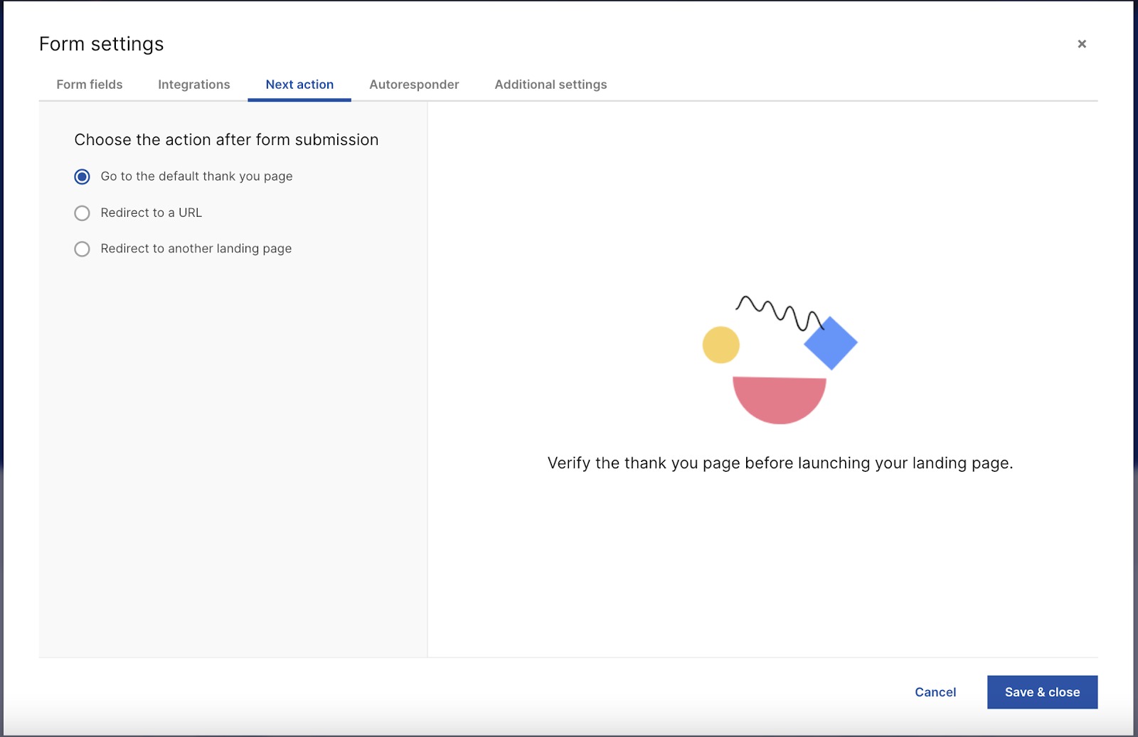
Options include:
- Go to the default landing page
- Go to another landing page (e.g., one created using Landing Page Builder)
- Redirect to another URL (e.g., another page on your site, unrelated to Landing Page Builder)
On the “Autoresponder” tab, you can specify whether you’d like to send a follow-up email automatically.
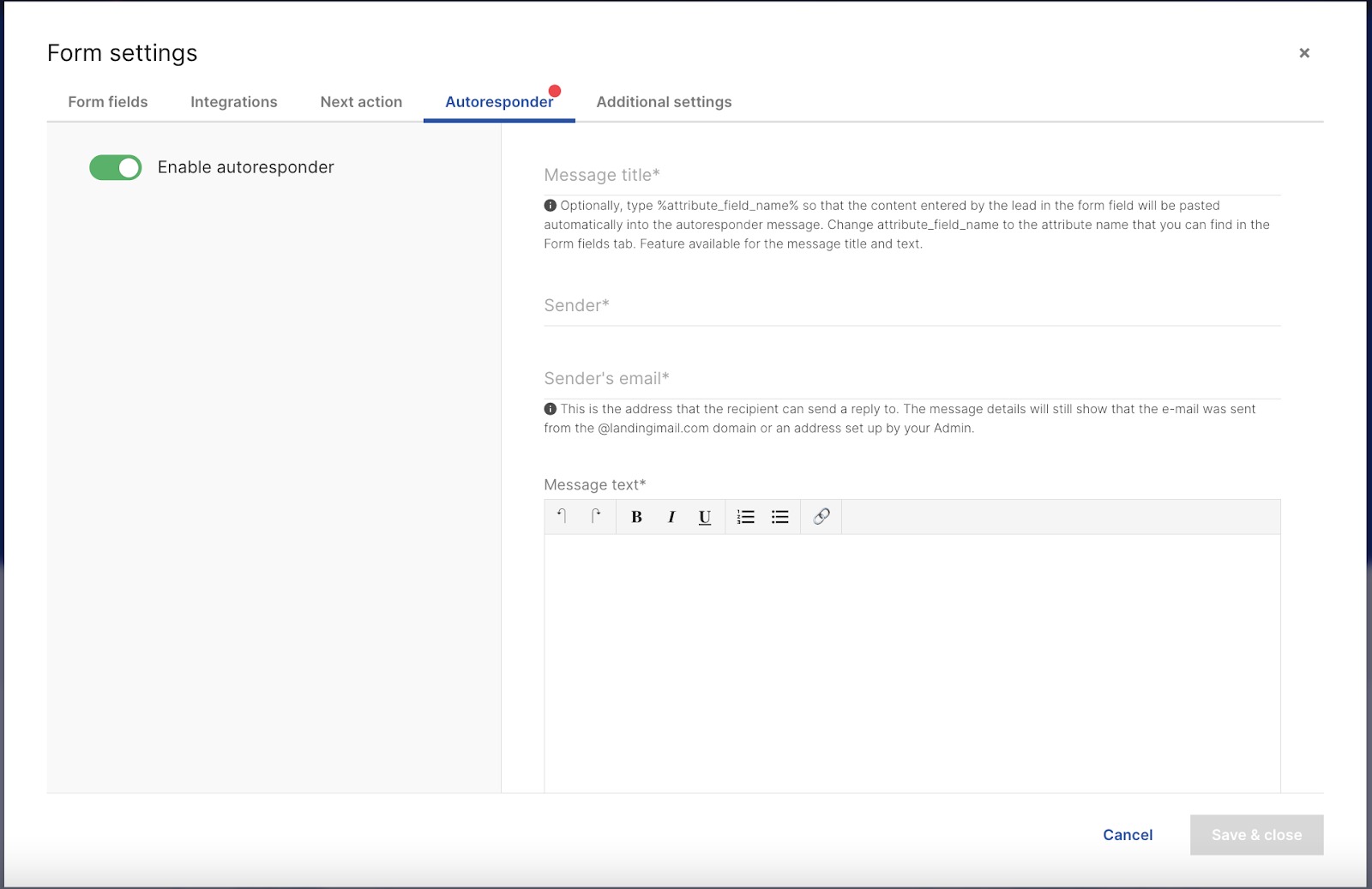
If you enable this option, you’ll need to enter a title or subject line, sender name, sender email, and email text. A red dot will appear beside the tab name if this option is activated.
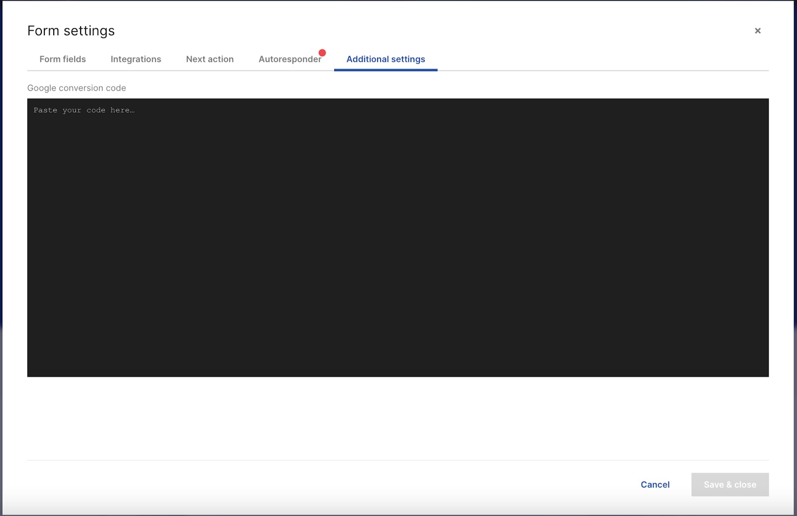
On the additional settings page, you can add conversion tracking tags.
When you drag a button onto your landing page, by default, it will only be a visual element—the button shape, color, and label text.
To customize the button design or associate an action with a button click, you’ll need to use the right sidebar.
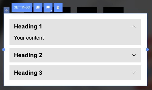
The accordion is a page element that can be expanded or collapsed by clicking to show or hide associated content panels. This allows for abundant content while saving space.
Accordions are used to create collapsible FAQs, expand terms and conditions, disclaimers, product/event descriptions, provide more details about a topic, pricing, bios, etc.
When you drag an accordion onto your landing page, by default, it will have three sections.
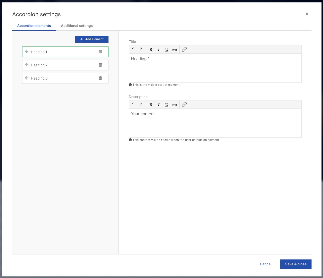
To customize the accordion, click the settings button at the top of the widget. Then, the “Accordion settings” window will appear.
The first tab, “Accordion elements,” allows you to add and modify elements to your accordion. To add a new accordion, click “Add element.” You can also edit the accordion title and description here.
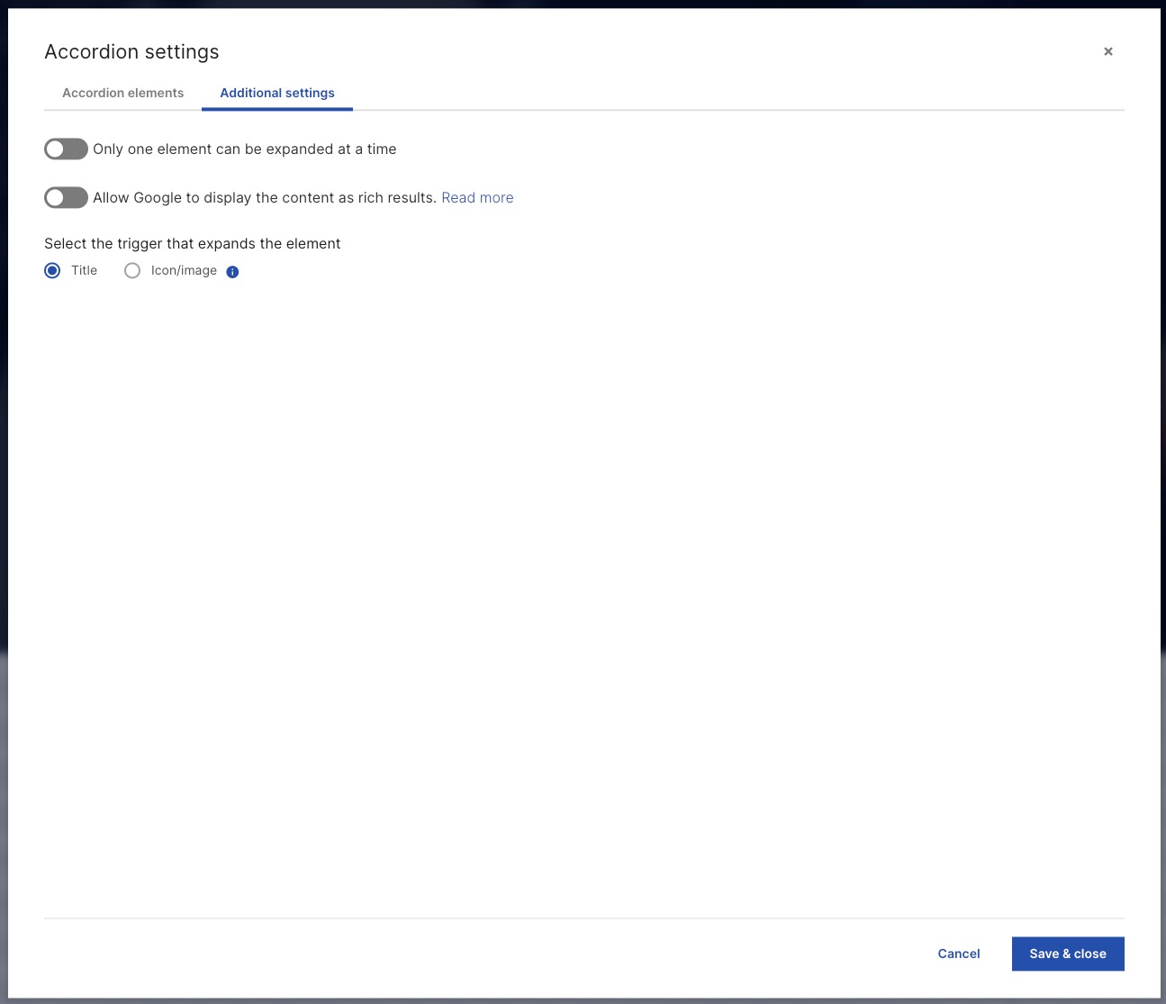
In the second tab, “Additional settings,” you can choose to expand only one element at a time and allow Google to display the content as rich results. You can also select the trigger that expands the element: title or icon/image.
The Counter widget counts the remaining days, hours, minutes and seconds until a designated date—for example, an event, contest or product release. By default, it looks like this:
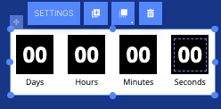
To set the counter or personalize its appearance, click Settings above the widget or in the menu on the right.
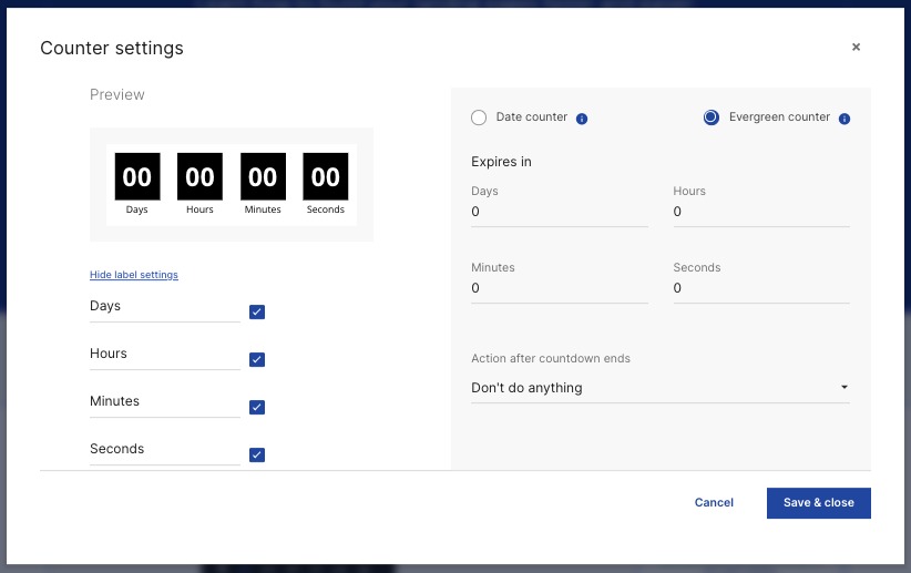
In the “Counter settings” menu, you can choose between two counter types:
- Date counter: Counts down to a specific date and time (e.g., counting down to an event)
- Evergreen counter: The counter allows each user the same amount of time no matter when they open the page (for example, to limit the amount of time a user has to complete an action)
In addition to setting the exploration date or time, you can also specify what happens when the timer reaches zero:
- Don’t do anything
- Redirect to a URL
Once you’re happy with your timer, click “Save & close” to apply your changes.
Clicking and dragging an image onto your landing page will automatically prompt the image selection window to appear.
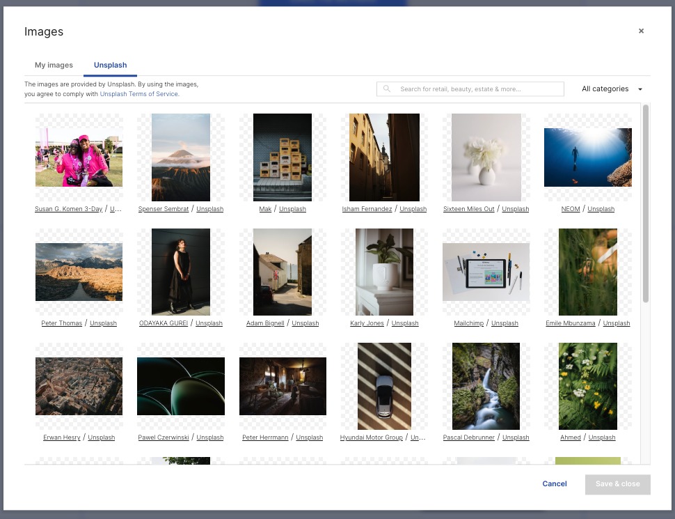
The image selection window contains two tabs:
- My images: Images you’ve already used
- Unsplash: A library of free-to-use images
The “My images” tab has a few unique options. You can:
- Upload new images
- Sort images into folders
- Edit images
To edit an image, first click on the thumbnail. Then, click the three dots icon to expand the menu.
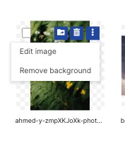
Clicking “Edit image” launches the image editor window.
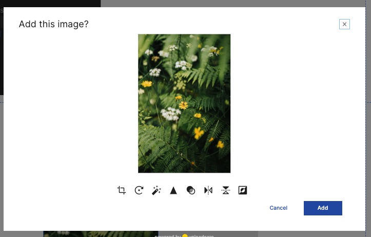
Image editing tools include:
- Crop
- Rotate
- Enhance
- Sharpen
- Grayscale
- Mirror
- Flip
- Invert
“Remove background” automatically removes the background of an image, making it transparent. As such, for images without a clear subject or background, this tool may not work.
Once a background has been removed, you will be directed to the image editor window as described above.
If you need a new image, search the Unsplash tab by keyword, or filter by image category. Click on any image, and then click “Save & close” to add it to your landing page, wherever you initially dragged and dropped the widget.
Icons are vector designs (e.g., symbols or simple logos).
Dragging and dropping the icon widget onto the page will open the “Vector icons” menu.
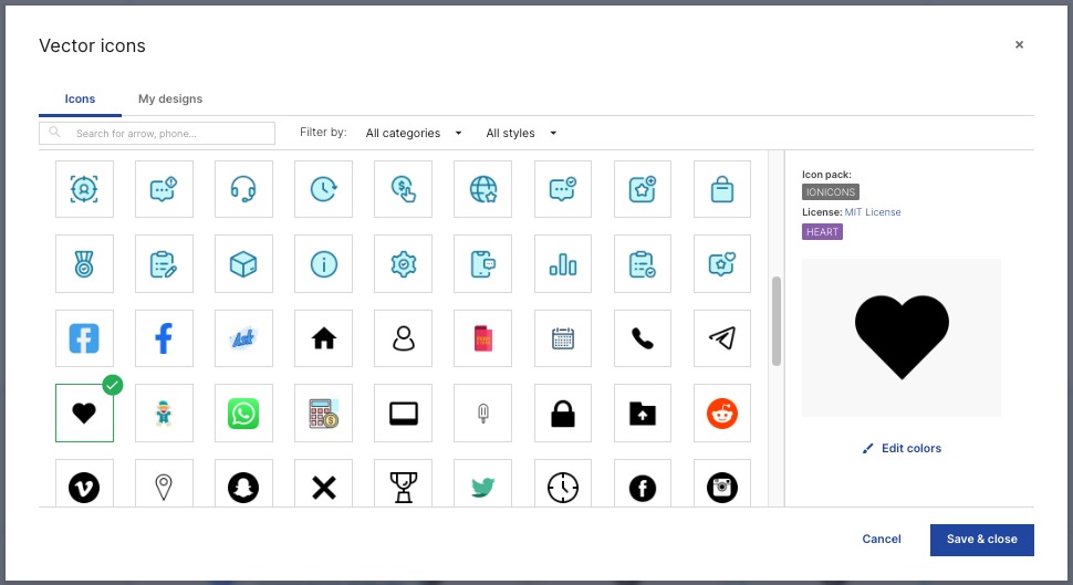
Search for your preferred icon by keyword, or choose a category and style filter to narrow down your options.
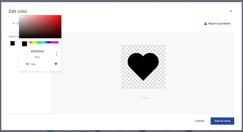
Once you select an icon, click “Edit color” to modify it as needed.
Then, click “Save & close” to add it to your page.
To add a video to your landing page, click and drag the widget into position. This will add the container where your video will appea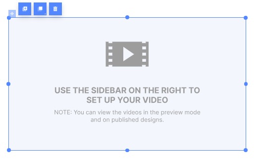
To add the video itself, use the right sidebar.
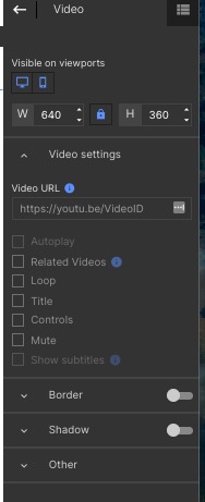
In the “Video settings” section, first paste the URL of your video.
Then, using the check boxes, customize how your video will appear:
- Autoplay
- Related videos: Show additional, similar videos after this one has ended
- Loop: Start playing again once it has finished
- Title: Display the video title
- Controls: Show video controls like play, pause, and volume control
- Mute: Automatically silence the video
- Show subtitles: Automatically show subtitles, if any were added to the video
The “Box” element creates a simple colored block.
When you place it on the page, by default, it appears as a small gray square:
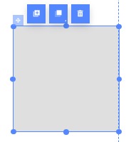
Click and drag on the side or corner to resize. To further customize, use the right sidebar. Additional customization options include:
- Changing the fill color and style
- Adding and modifying borders
- Adding rounded corners
- Placing a shadow behind the box
If the above page elements don’t suit your needs, the HTML element enables you to code one for yourself.
First, drag and drop the element onto the page. This box will determine how much space it will occupy in action.
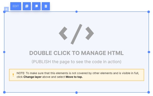
Double click to open the HTML editor.
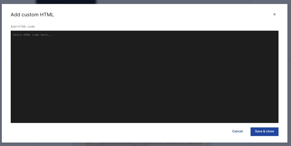
Here, you can write or paste your custom HTML. Then, click “Save & close” to add it to your landing page.
Please note that you will need to publish your page to see the completed code.
 返回到 App Center 类别